The Media Lab has a giant tower full of gold coins, which students and faculty use to relax as they swim around it and make tunnels. The tower doesn’t fill itself, though — sponsors do! The Lab is funded by companies across the world, and in return those companies get rights to any intellectual property created there. I haven’t been around long enough to know if this ends up twisting people’s research in special directions, but I get the idea that it does not; people here seem to work on whatever inspires them in the moment.
The reason I’m explaining all this is to give background for why I’ve been extra busy for the past three weeks — preparing for and participating in sponsor week. This is a bi-annual celebration where all the sponsors come in to see what sorts of insanity have been going on. As a first year grad student I was encouraged but not necessarily expected to have any demos of my own to show off, but I ended up getting involved with two projects that ultimately yielded something worth showing.
Exhibit A: Glass Infrastructure
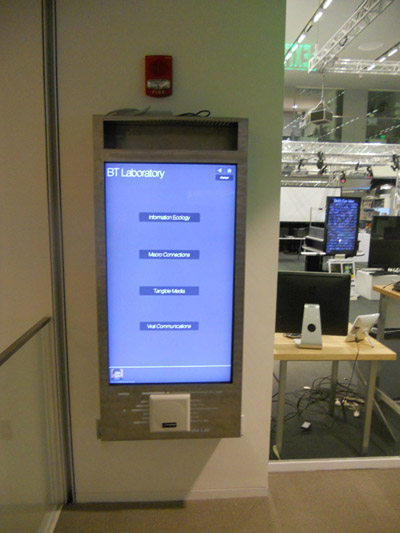
The new building has a network of giant touch screens which are located outside of each lab-space. Each screen is set up to display information about whatever research groups are located nearby, which allows visitors to explore the projects being worked on inside. The screens are ALSO wired up with RFID readers — which means if a person has an RFID card the reader can tell who they are, and the interface can change itself based on their interests.
It turns out that these screens are actually a research project! They were set up earlier in the year for the previous sponsor week as a joint effort between four groups at the lab. My adviser suggested I get involved in the creation of “version 2” which turned out to be a complete redesign of the interface. The team consisted of about 7 people, and I helped design and implement the new front end (i.e. the part that actually gets used).
The OLD interface was pretty much two interfaces in one. The first interface was a mini directory, which listed the research groups in that space and had a quick description of the group along with a rotating display of the projects being worked on by whichever group was being highlighted at that moment. From there the user could navigate to the second interface by selecting one of those projects.
The second interface simply showed 5 projects at once — the primary project was whatever the user picked, and the other 4 projects were “similar projects” which the system would select. Users with RFID tags could also “charm” projects (i.e. favorite them), which meant that whenever they walked to a screen they could share favorites with other people or quickly jump to learn more.
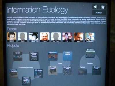
There were several problems with the old interface. The first was that people were not really part of it — you didn’t know who was in the group or who was working on a given project. The second was that you didn’t know WHY other projects were being suggested, you pretty much had to guess. For the new design we wanted to try to create an experience that provided this extra information, but also somehow combined the two “views” into one consistent view.
The redesign process was exhausting! There were many intense discussions between the more front-end focused people on how to achieve everything we wanted in the UI, and after about two weeks of mockups and prototypes we finally had something that we actually felt had some real potential. The projects are now clustered together based on the “ideas” that they share, and we have a completely new way of navigating the people, projects, and research groups at the lab.
Exhibit B: Wall Paper
The second project I worked on was a solo project (although I got a lot of help and advice from my fellow grad students!) My group once had an installment called the “octo display” which was 8 identical HD screens all connected to one computer. This display was dismantled when my group moved into the new building, and since then the screens have been sitting around gathering dust.
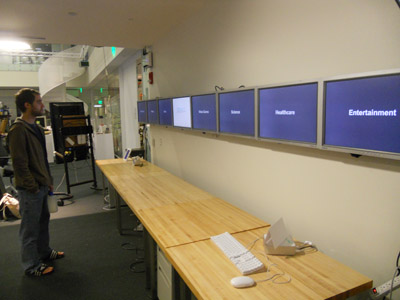
Rather than let them go to waste, though, we decided that it would be interesting to put them up in a long line and use proximity sensors to detect where people were standing in front of them. The idea was that eventually there will be a lot of surfaces with the ability to display information, but that will get noisy fast if all of the displays are constantly rendering things. I volunteered to give it a shot, and I’m glad I did!
Building the thing was pretty rewarding. For one thing I learned how to use sensors, and for another I learned how difficult it is to mount 8 screens in a straight and level line. You can read more about the construction of the wall here — I ended up using a giant robot to carve out the mount boards and drill holes in exactly the right locations.
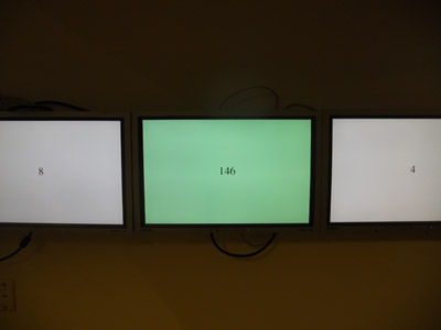
The sensor part of it is also pretty cool: there are these devices which you feed power into and it uses IR to detect the distance of objects in front of them. Depending on the distance, the devices output a sliding voltage (when you walk closer, the voltage goes up). This means that you can write some code to analyze the voltage and, if you put one of them in front of each monitor, write a program that knows where people are standing.

A quick demo program I wrote -- the number reflects the voltage and the screen turns green when someone is standing in front of it.
For anyone interested in more of the details, I used an Arduino for the first time to collect the raw voltage information (I’ll explain more about what that means in a future post), and then I wrote a quick python script to pull that information off of the Arduino and drop it into a file accessible to the web, and then I had a web page which read that data and responded appropriately when someone walked up to a screen.
For the final demo I tied the screens into the New York Times API. Each screen displayed a word or phrase (i.e. “Healthcare” or “MIT Media Lab”) and when you walked up to a screen it would pull up an article from the NYT relevant to that topic. It turned out pretty nicely, although there was a very slight amount of lag.


